iTrack Re-design Project
Re-design University of Michigan Information School's
comprehensive online recruiting system
Type Team Project | Sunny Kim, April Shin
Role UX/Web Designer
Tools Sketch, Balsamiq, Adobe Illustrator, Adobe Photoshop
Timespan Fall 2018

The Challenge
The University of Michigan School of Information has its own comprehensive online recruiting system
“iTrack,”
which
allows students to apply for jobs, research companies, gain industry contacts and manage their job search.
However, as target users ourselves, we had a hard time navigating through iTrack. As students of the
University of
Michigan School of Information, we decided to challenge ourselves by redesigning the user experience of
iTrack's
landing page.
Design Process
We followed the below user-centric design process.
1) Analyze the current Information Structure
2) User Research & Interview
3) User Problem Statement
4) Competitive Analysis
5) Redesign ideal user flow
6) Ideation & wireframing
7) Final Design
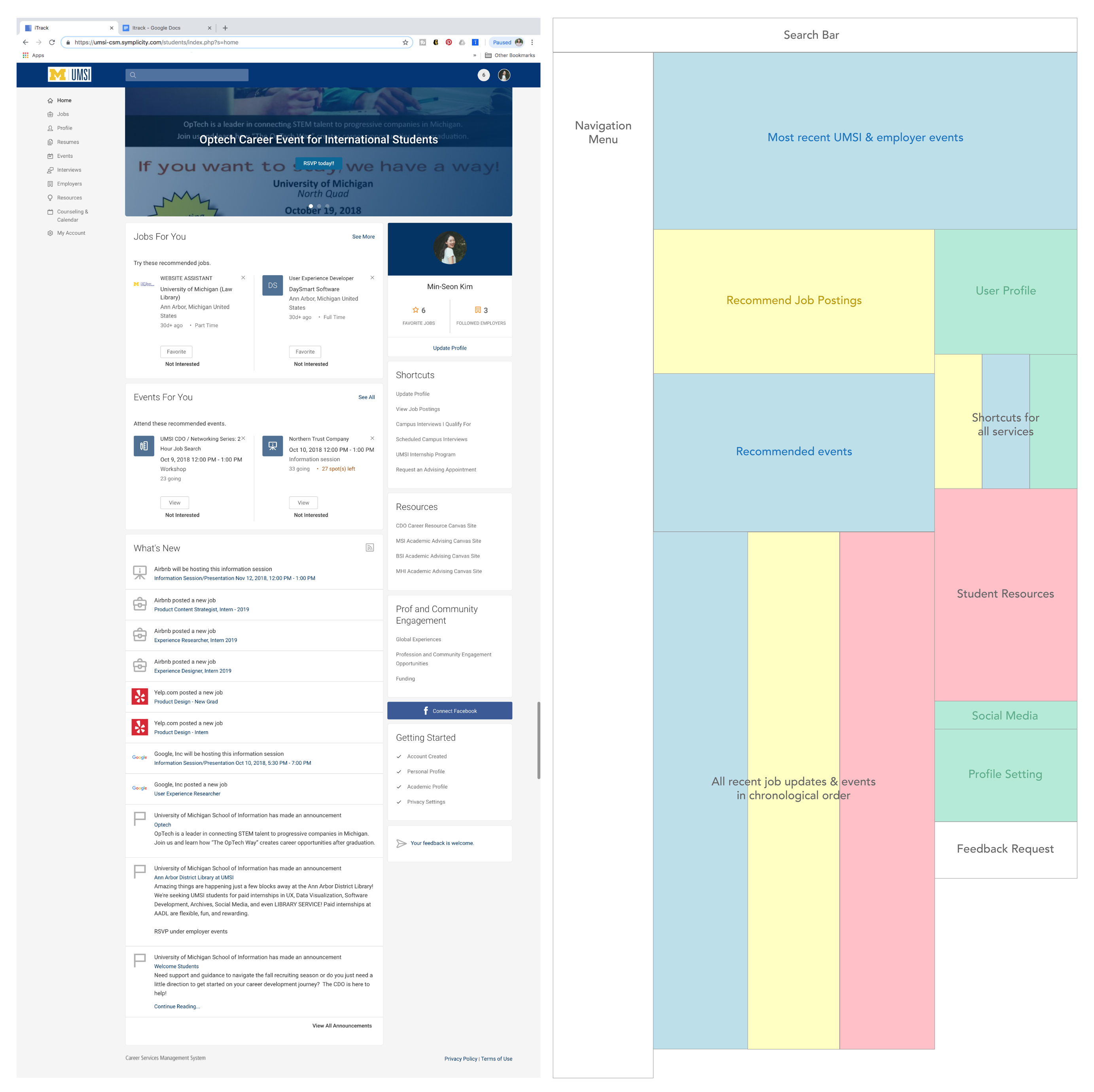
Current Information Architecture
Information Architecture (IA) is the way of deciding how to organize and structure the contents of the website
or
mobile applications. Its goal is to users find the right information and complete tasks.
The importance of well-designed IA can’t be stressed enough because it directly impacts the overall
user experience and
user satisfaction. To better understand the current IA of ITrack’s landing page, we mapped out their current
content
and color coded the related sections.
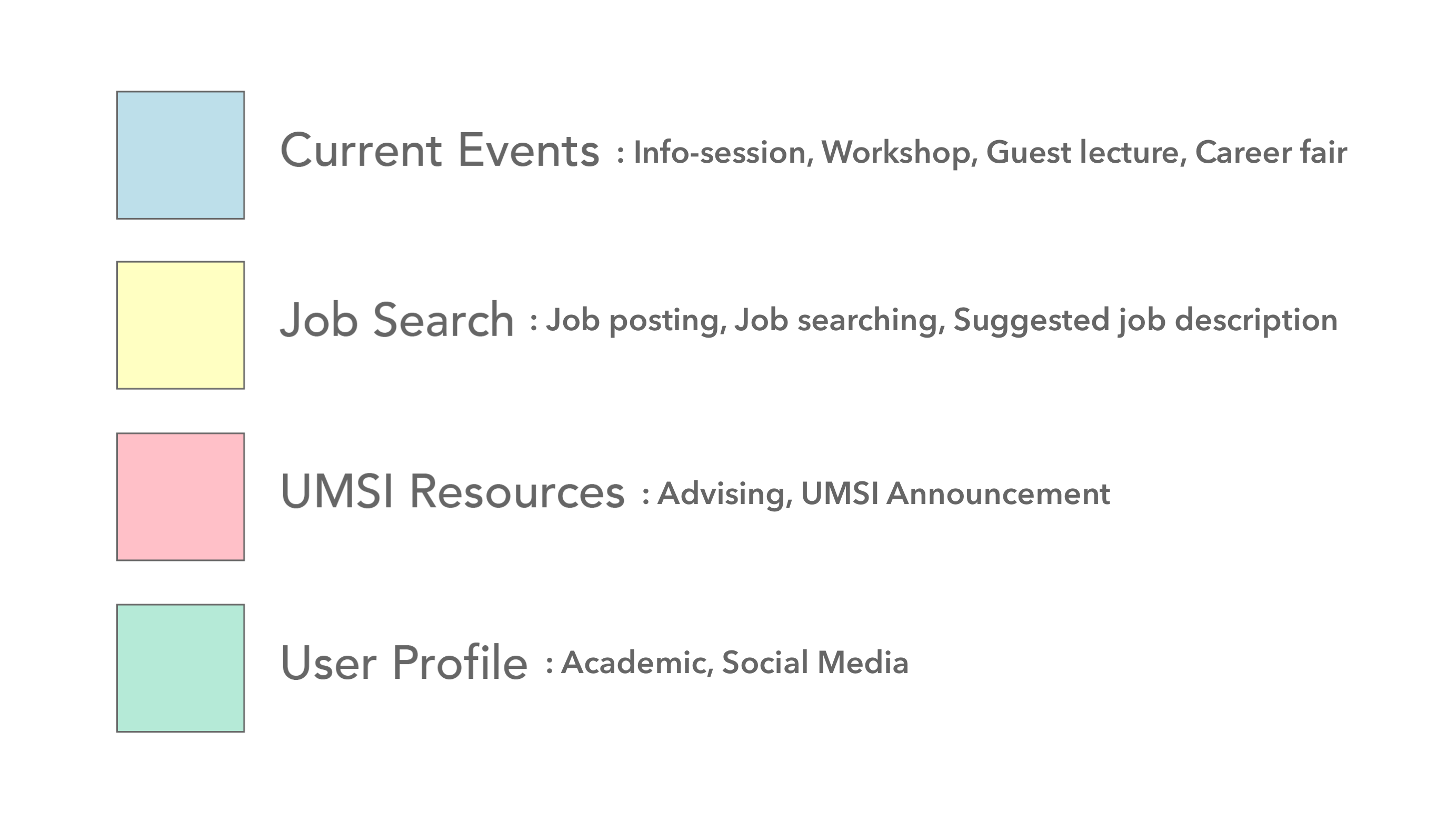
First, we organized the contents on the landing page into 7 categories:
Landing Page Functions:
1) Current events
2) Job search
3) UMSI announcement
4) User Profile
5) Advising scheduling
6) UMSI resource
7) Social media integration
Then, we narrowed these down to 4 categories.
Based on the 4 categories, below is the analysis of current iTrack landing page desktop view.
Landing Page Perception & User Research
We asked users to browse through iTrack’s landing page on desktop to understand their pain points and evaluate current landing page interface.
1. What is your first impression of the iTrack’s landing page?
Unorganized: “I can’t find what I need. There’s just too much going on.”
Bombarded: “The contents is just all over the place.”
Lack of Focus: “The main announcement banner is overwhelming and I don’t really care.”
2. What do you like about the landing page the most?
Credibility: “I like credible resources validated through UMSI.”
3. What do you like about the landing page the least?
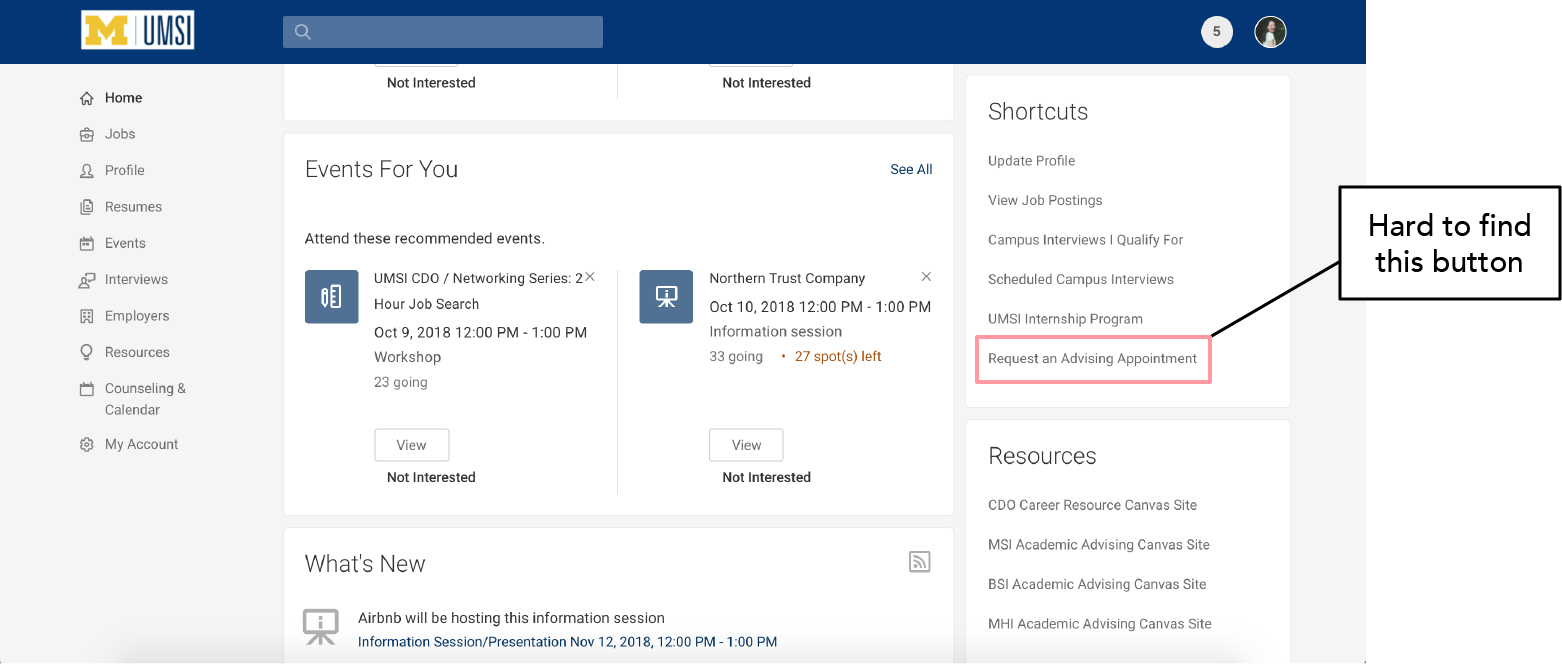
Login process: “It is a real hassle that it requires me to log in every time users click on the website logo."
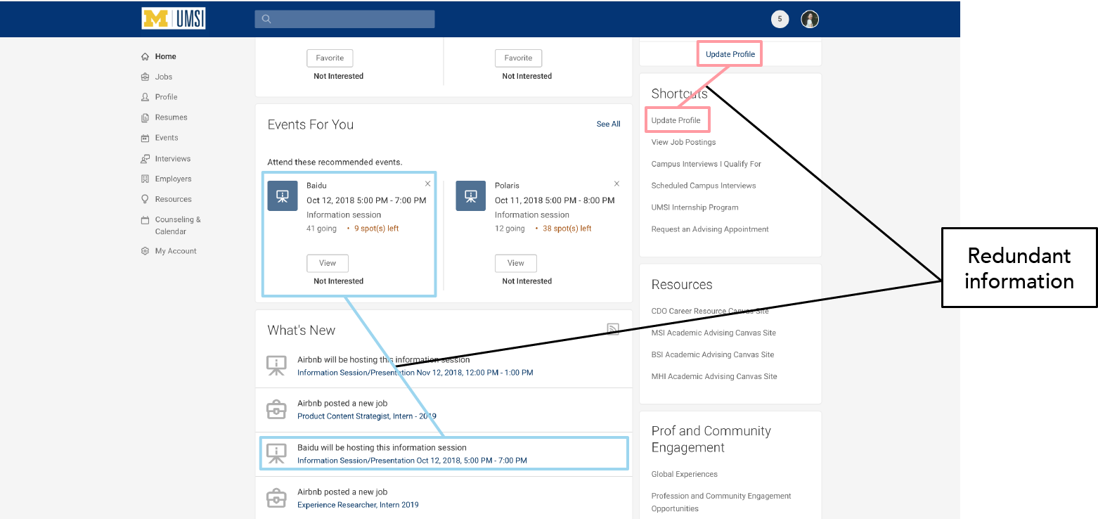
Redundant information: “I hate it requires me to log in every time clicking on the website logo."
Lack of navigation: “Too hard to navigate and find necessary information."
Lack of importance hierarchy: “Too many unimportant information highlighted."
Account setup process: “I experienced inconvenient user setup process."
User Problem Statement
Based on our previous user research, current iTrack users are having difficulties in:
1. Locating desired information to complete target tasks
2. Focusing on relevant information in the midst of redundancy
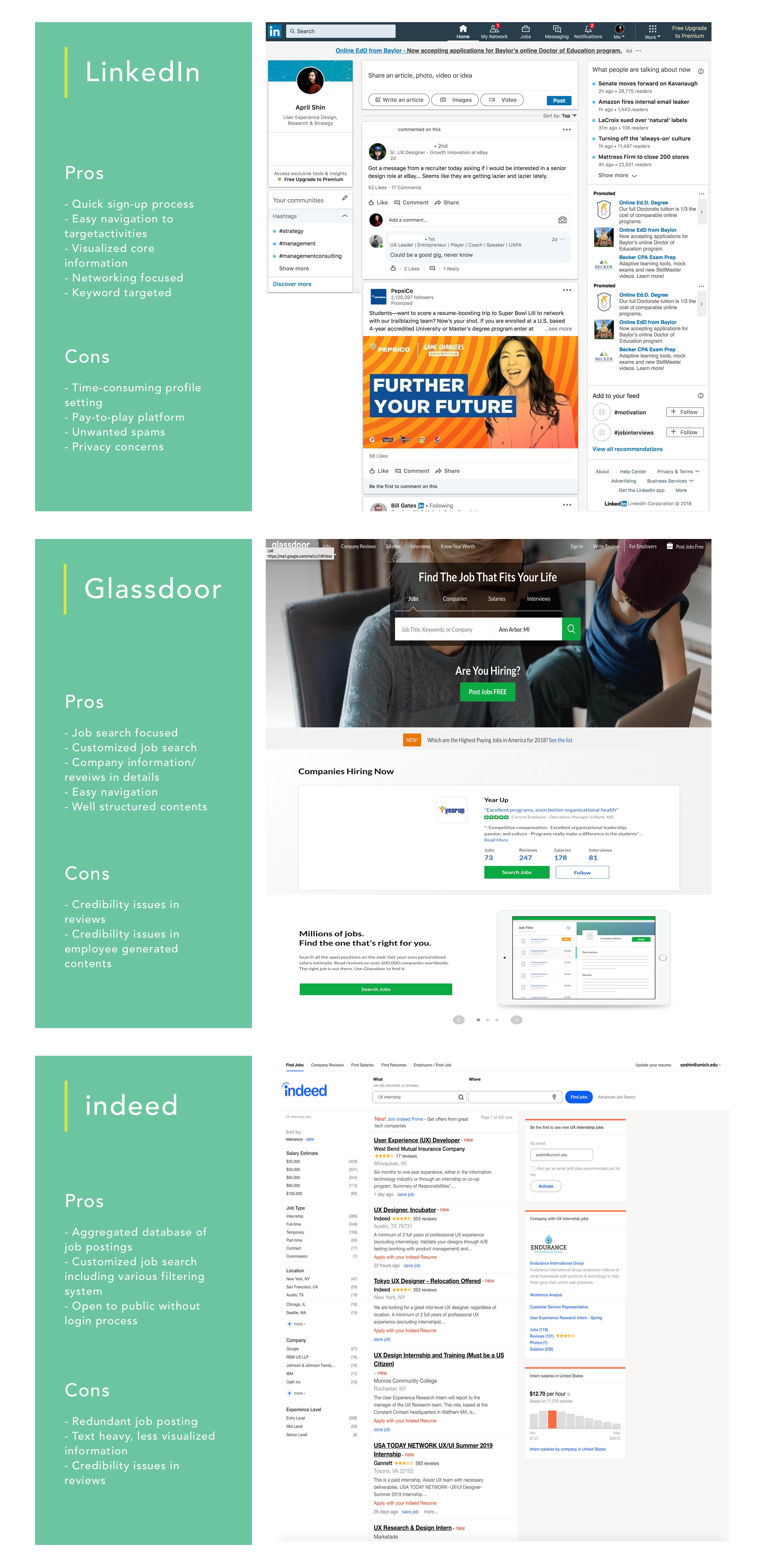
Competitive Analysis
In order to address such problems, we compared iTrack with top three existing recruiting platforms Linkedin, Indeed, and Glassdoor.
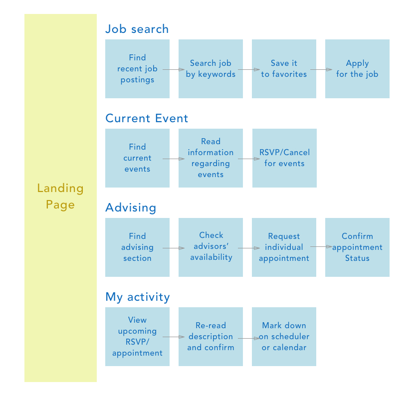
Ideal User Flow
Given useful insights from user research, IA and competitive analysis, we sat down re-organizing the “ideal
user flow”
of iTrack. We divided the users into four groups with different needs.
Here is an ideal user flow chart we created:
Ideation
Based on what we had thus far, we brainstormed and started the ideation process. Each of us sketched our own solution and explained the reasoning behind the designs. After sharing the pros and cons of each design, we then combined them into a better solution.
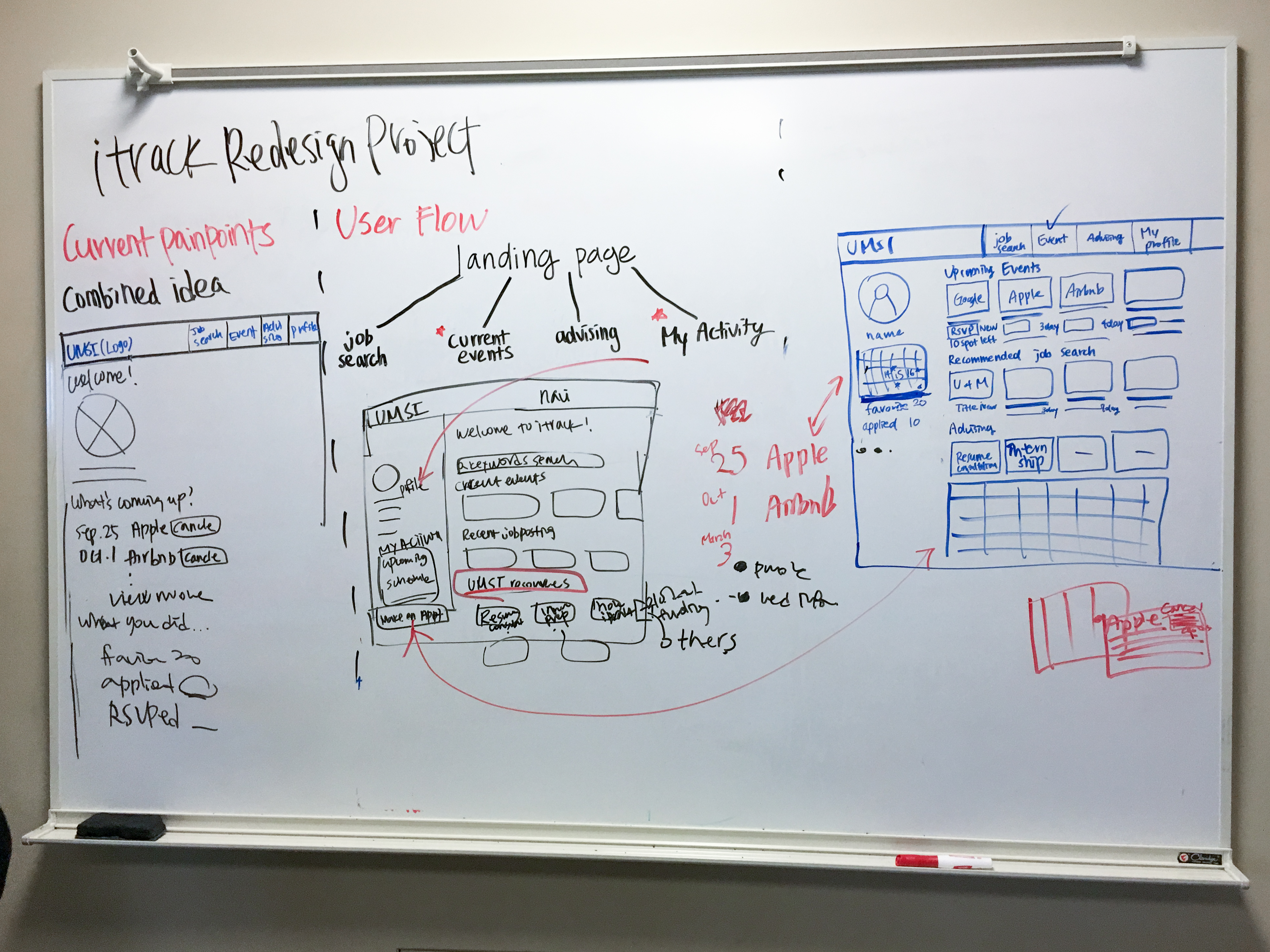
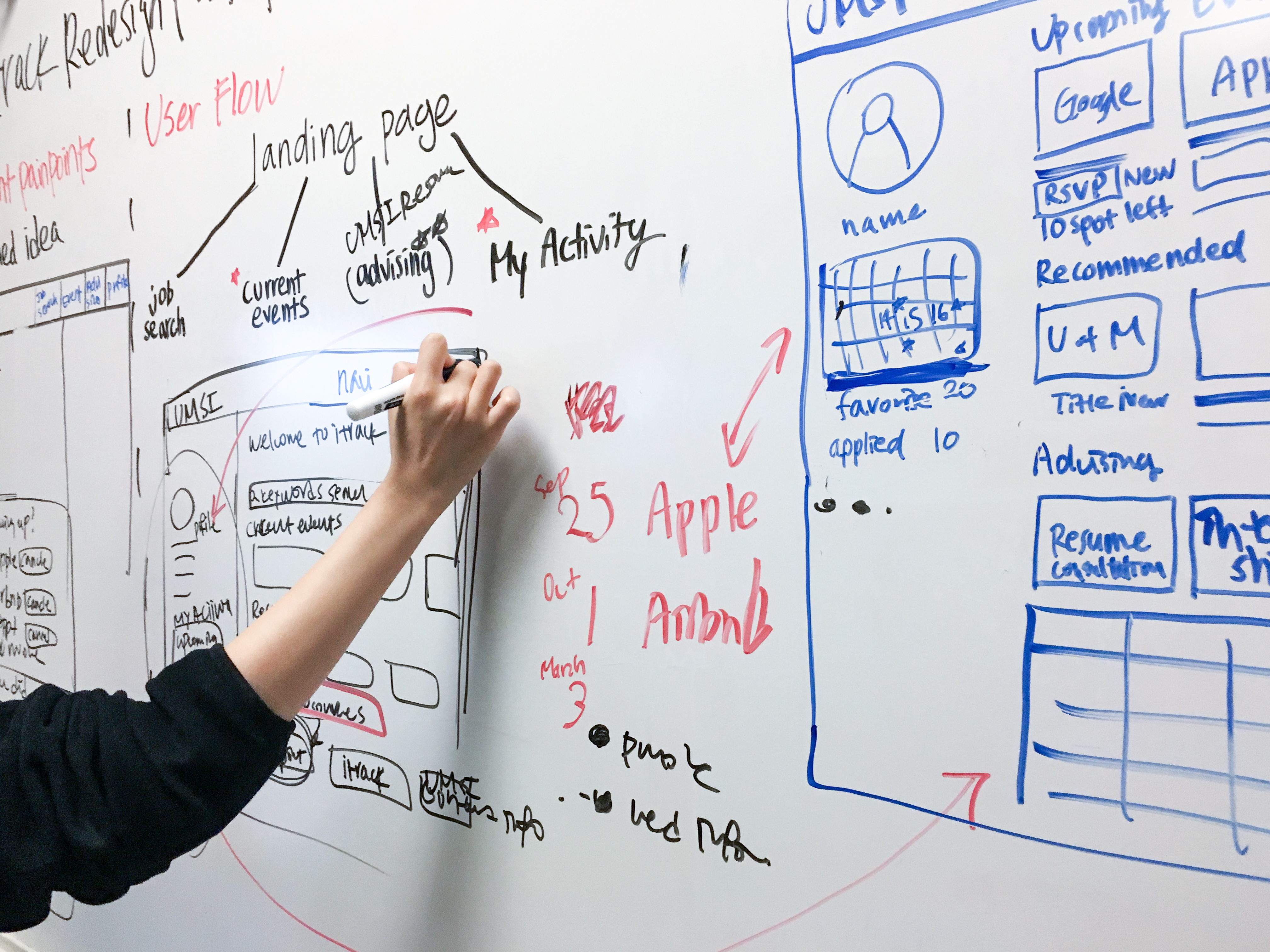
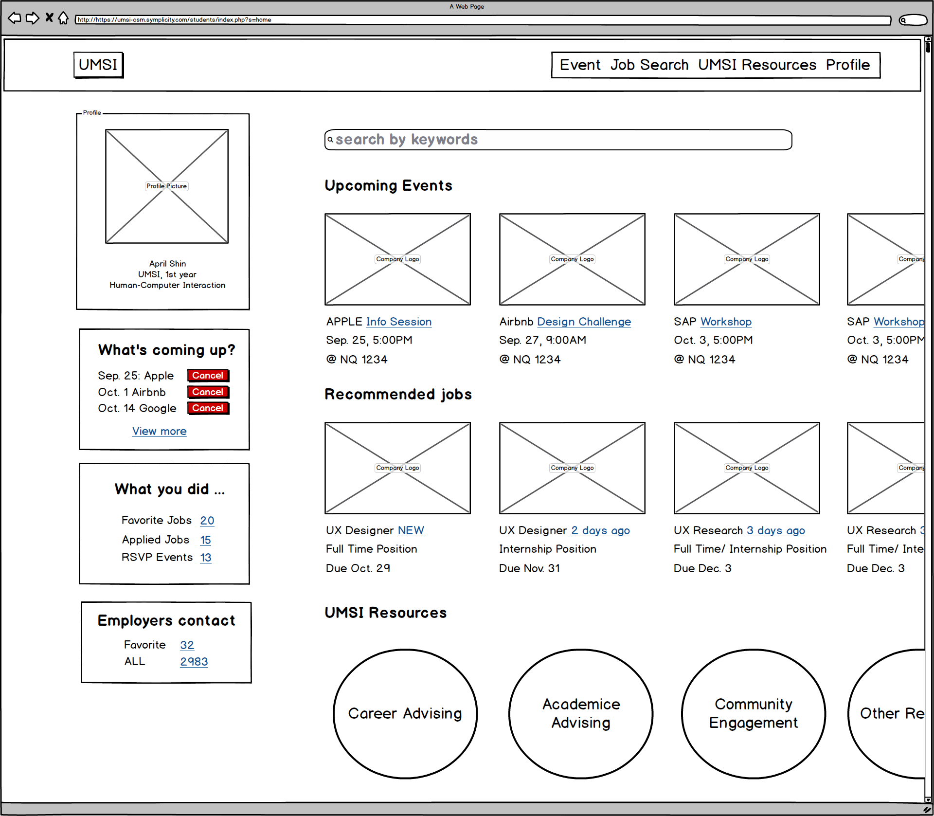
Wireframe
After, we conducted wireframing based on our ideation sprint. I used balsamiq to wireframe in this process.
User Feedback & Design Iteration
After the initial wireframing session, we felt like the information under User Profile section was
redundant. So,
we wanted to consolidate some of the features to eliminate redundant information and personalize the User
Profile
section.
We conducted a quick user poll with 23 students at the University of Michigan School of Information to
see
which design
users would prefer. Out of 23 students, 16 students indicated they prefer the calendar layout.
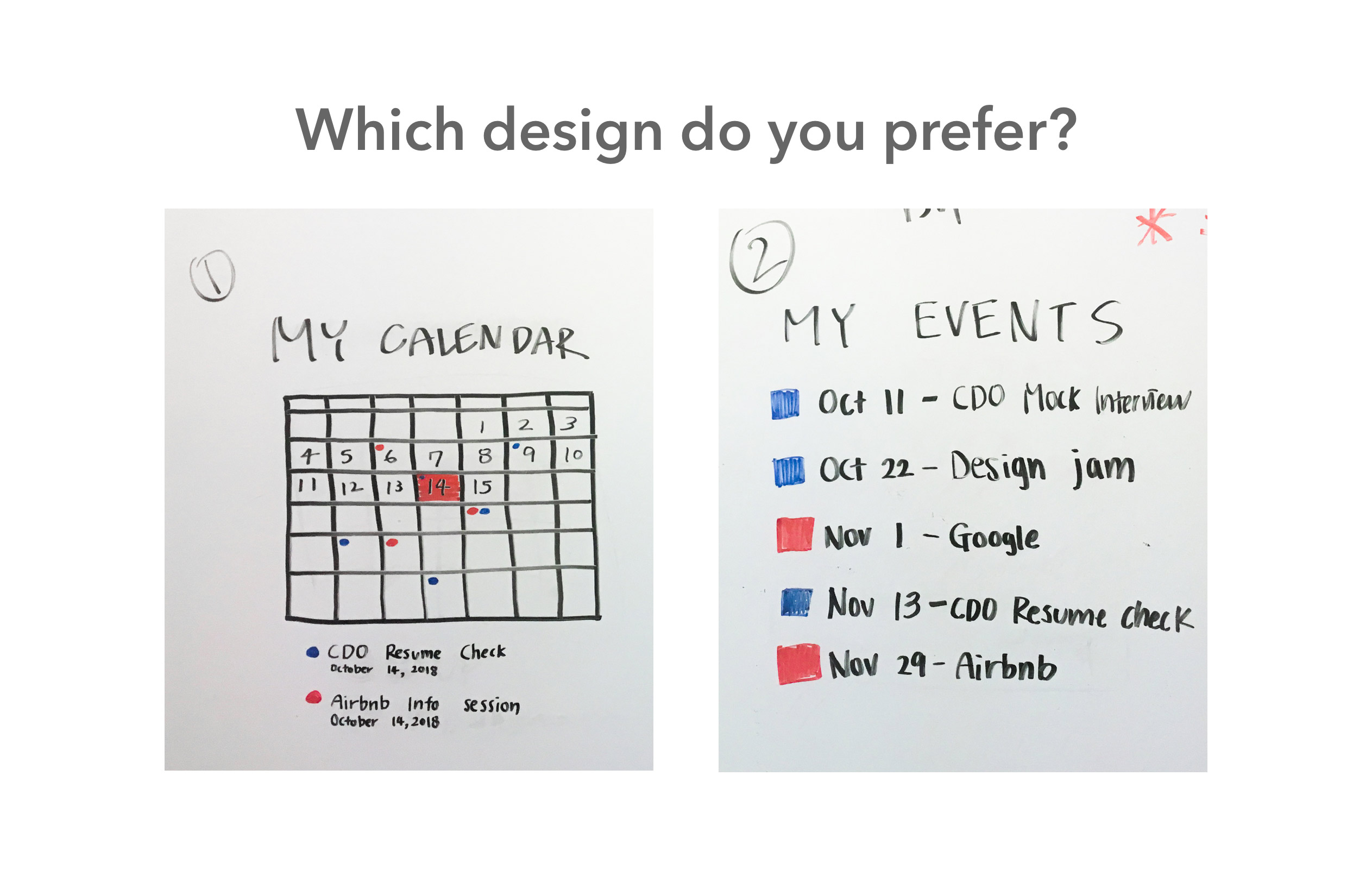
After gaining user feedback, we decided to add a calendar that visually shows upcoming appointments and career-related events the user signed up for. Instead of displaying upcoming career-related events on the What’s coming up? section, this new calendar allows users to have a better understanding of what is going on.
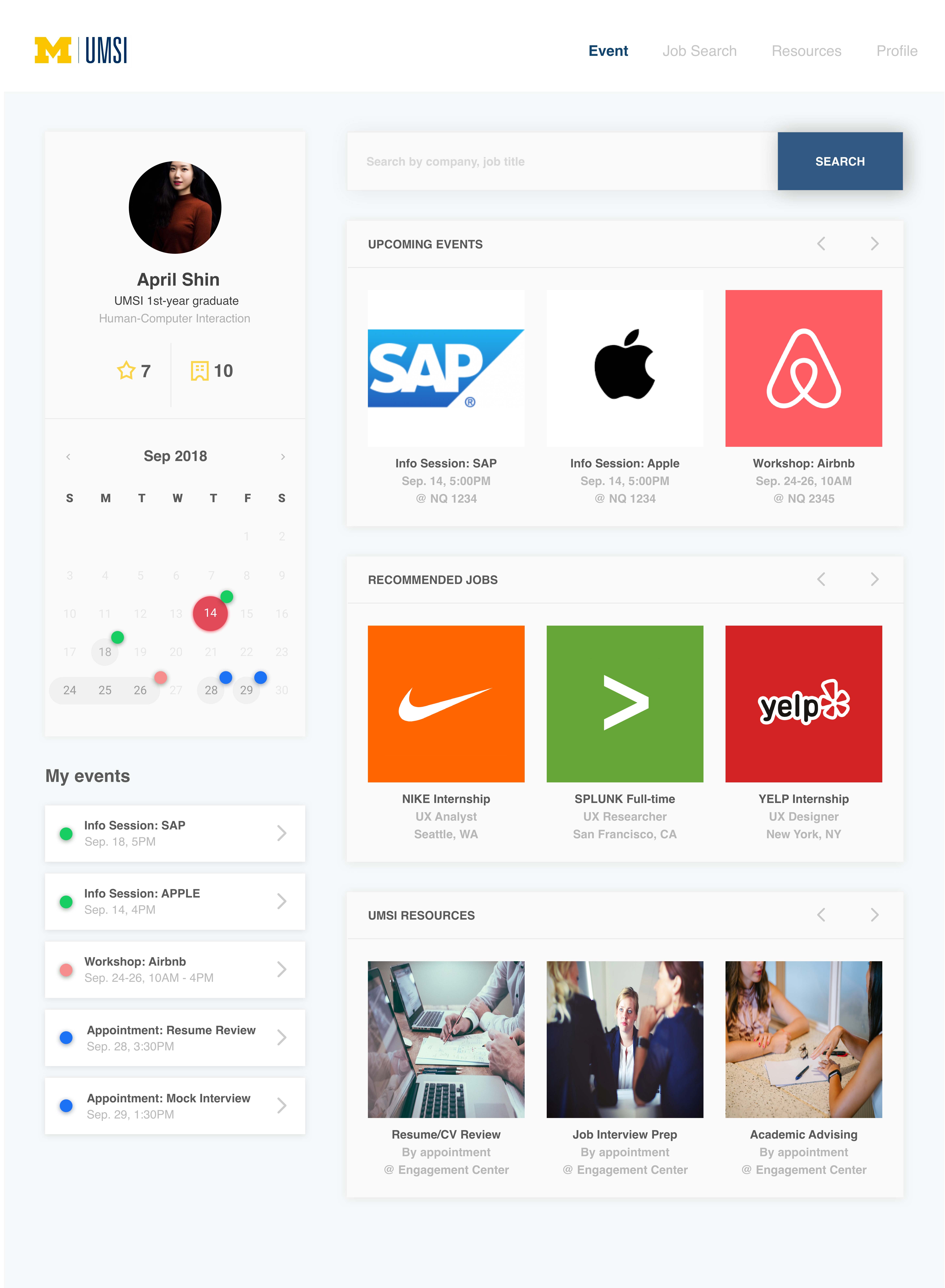
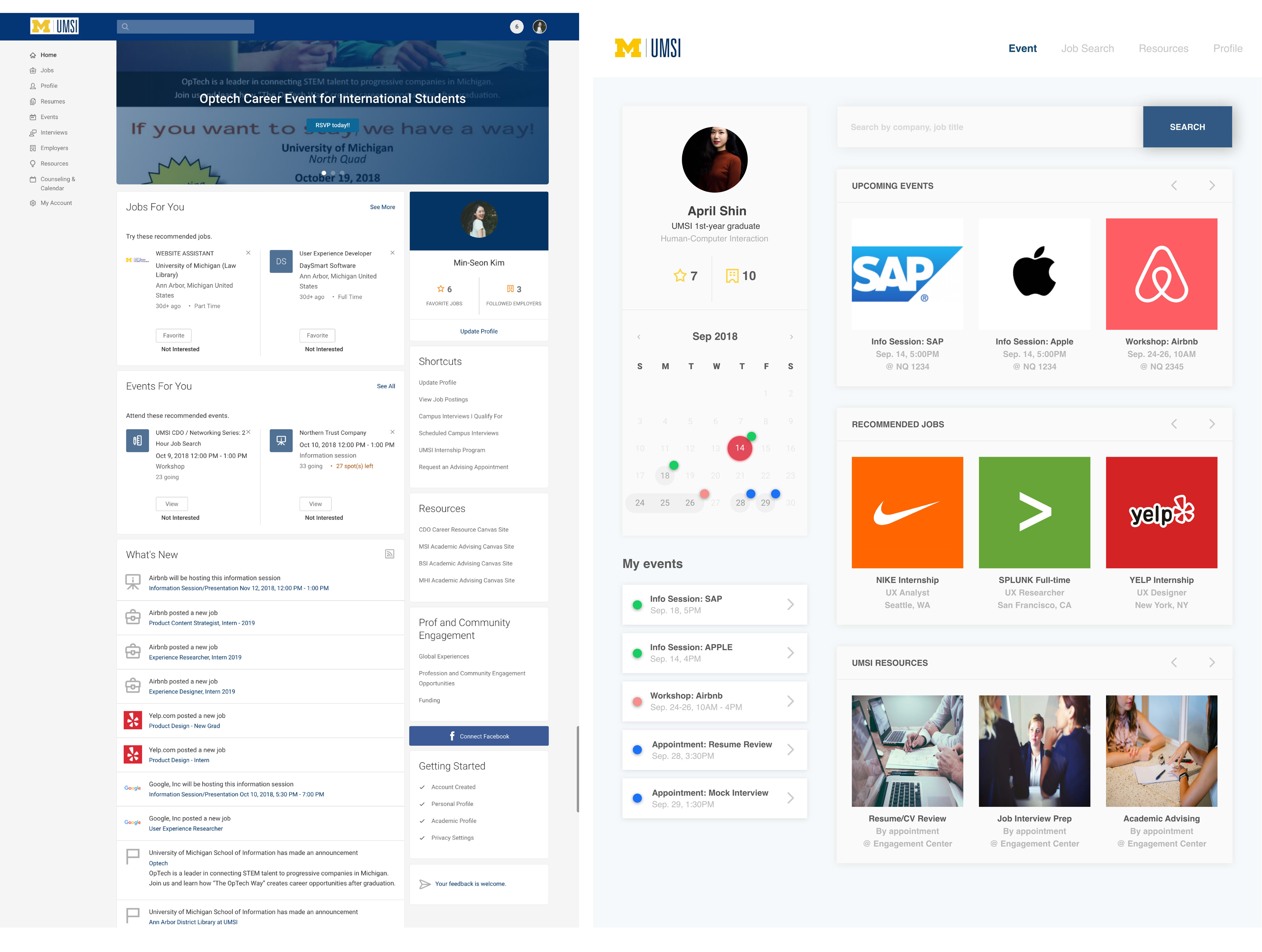
Final Design
After combining user insights on iTrack’s current landing page and new design ideas from ideation session, we came up with a new landing page for iTrack. This new landing page provides better user experience with its clean look and well-organized contents.
Design Changes and Reasoning
Followings are some of the reasonings on why we changed the design elements on iTrack’s new landing page.
1. Top Navigation bar
Why?
In iTrack’s current system, the navigation bar on the top never plays its expected role. A random search bar located on
the top without any explanation leads users to question what to search for. Even though a navigation menu exists on the
left top corner, it is unclear and redundant in terms of contents organized within each category. This menu only
confuses the user’s experience on iTrack.
We propose a navigation bar with key four features that users could utilize the most : Events, Job Search, UMSI
Resources, and Profile. Each menu item is clearly distinct and guide the user to easily complete his or her target
tasks.
2. User-Centric Profile Section
Why?
The current user profile on the top right corner of the landing page displays profile image, user name, favorite jobs,
and followed employees. However, this section doesn’t serves its full purpose as it doesn’t help users to check their
current application status nor advising sessions.
One of the concerns from user interview was that they don’t remember what info session or career events they have
rsvp’ed to attend. This new user profile allows each user to check their activities and track any upcoming events.
3. Card Layout
Why?
Following the user feedback received from interviews, we decided to design a cleaner layout for upcoming events and
recommended job postings. As Upcoming Events and Job Posts sections are where users are most frequently looking for
information, we are highlighting these two sections with a more organized layout.
Reflection
Through this project, I truly realized that
UX design might bring contents to new life.
During process, we were surprised that iTrack has its own countless useful information for students.
However, those contents were buried, hardly being recognized due to lack of user-centric web design.
In this regard, the importance of UX cannot be underestimated at any point.
This is not only for users, but also for service providers whoever want to maximize
in utilizing their contents.
View More Projects