Route Creator
An application that allows you
to make your own routes in the most convenient way
Type Team Project | Rachael Kim, Eunyoung Lee, Seoyoun Baek, April Shin
Role UX Designer
Tools Sketch, Protopie, Adobe Illustrator, Adobe Photoshop
Duration 3 weeks | Received 3rd place at Fast Campus design competition
Service Slogan Create your own routes in less than a minute. It’s super
quick,
flexible, and easy.
Overview
I was given this project when taking full-time UX school at Fast Campus. Fast Campus UX School
is a competitive and intensive 3-month long
UX design program like General Assembly. We as a team, were given the challenge, "Design a travel application."
While conducting extensive background and user research, I figured that there are many user problems untapped in travel application, and particularly noticed that many users have experienced problems in finding the most efficient travel routes quickly and conveniently.
Based on rigorous research with insightful analysis, we decided to solve the problem in finding the most efficient travel routes.
The Route
Creator was nominated 3rd place in in-house final design
competition among 23 teams.
JUMP PAST SOLUTION TO RESEARCH
The Solution
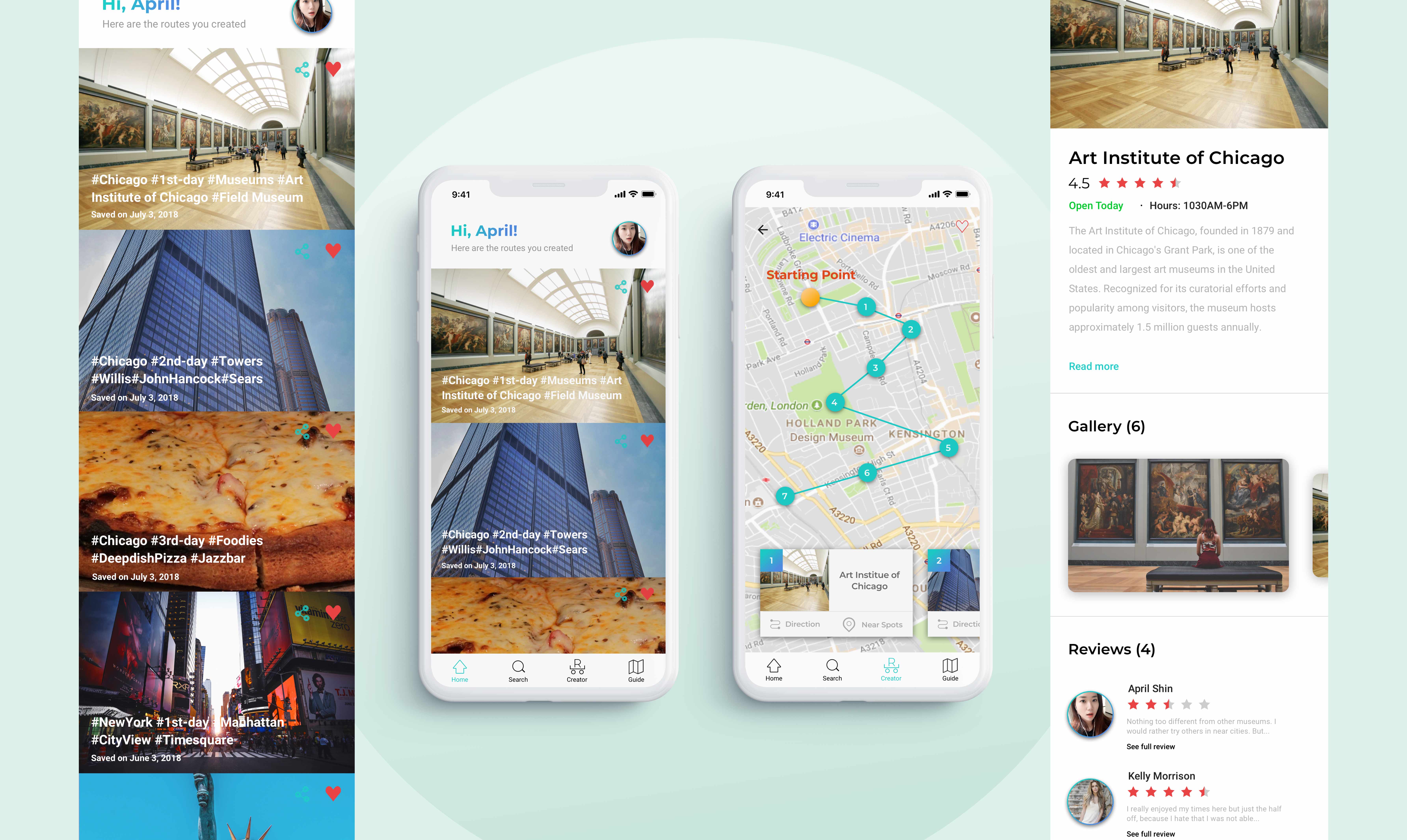
Route Creator is an application
that immediately creates the fastest route based on users' input. Users can add and subtract their wishlisted-places just like a shopping
cart.
Why this solution?
1) Save your time and effort
Although there have been many travel applications, many users have problems that they still need to spend substantial time and effort to make a solid travel itinerary.
Route Creator would allow users to save their wish-places whenever, and create their unique routes based on users' input immediately.
2) Change your plans flexibly and quickly
From user research, users have problems when they have to spend too much time when changing their travel plans unexpectedly.
Through Route Creator, users can always add or subtract desired places and re-create their own route instantly.
3) One-stop solution for your travel plan
From user research, users use average two applications when making travel plans, which is not desirable. Route Creator not only creates unique routes for users, but also provides essential information regarding their travel plan within the application.
3) The concept of route (shopping) cart is creative, original and effective.
From user research, users were very satisfied with the idea of route cart, just like shopping cart. Users can always add and subtract wishlisted-places into route cart and immediately create their own route quickly and easily.
Key Screens & Features
1. Onboarding & Login
Splash and onboarding screens allow users to quickly learn about the application.
Users can either use social accounts or use email address to login.
2. Search & Add Places
Users can search places by name or address and add those places to Creator tap like shopping cart.
After the search, users can either keep searching to add more places to Creator tap or directly going to Creator tap to create their own route.
3. Create Your Route
Creator tap is like a shopping cart. Users can always save and subtract places they wish to go.
Users can also review essential information about the places. Once users decide all the places they want to add to their itinerary, users finally put their starting point to create their own route.
4. Enjoy and Save Your Route
Route Creator immediately creates the fastest route based on places they added to their Creator tap. They can also view Direction to see transportation and Near Spots to see what other popular places are nearby.
Users can save those routes and find them on home screen. Guide tap will provide a quick guide for the application and overall travel tips.
Approach
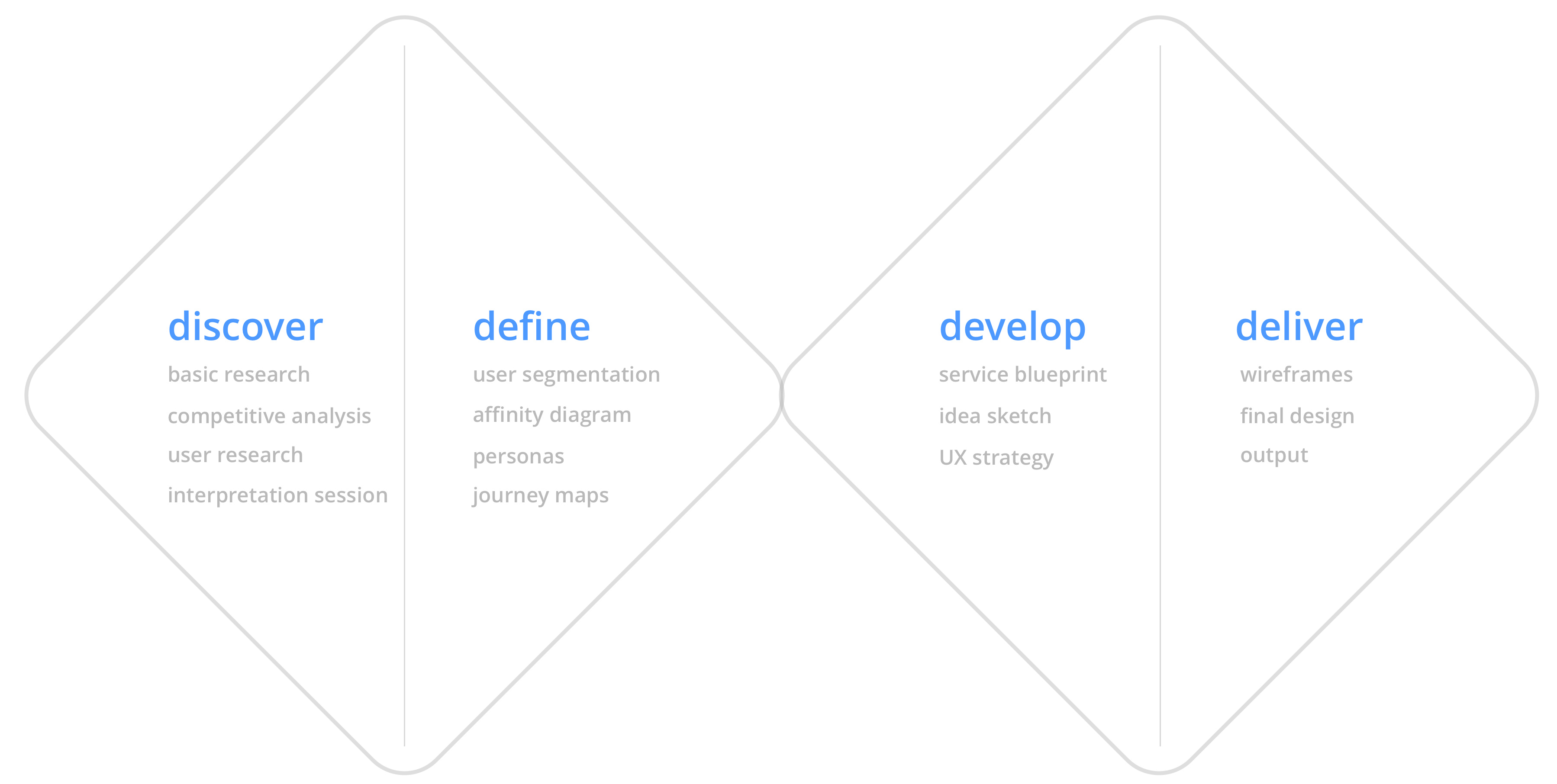
I adopted the “Double Diamond” Methodology: Discover, Define, Develop, and Deliver.
Basic Research
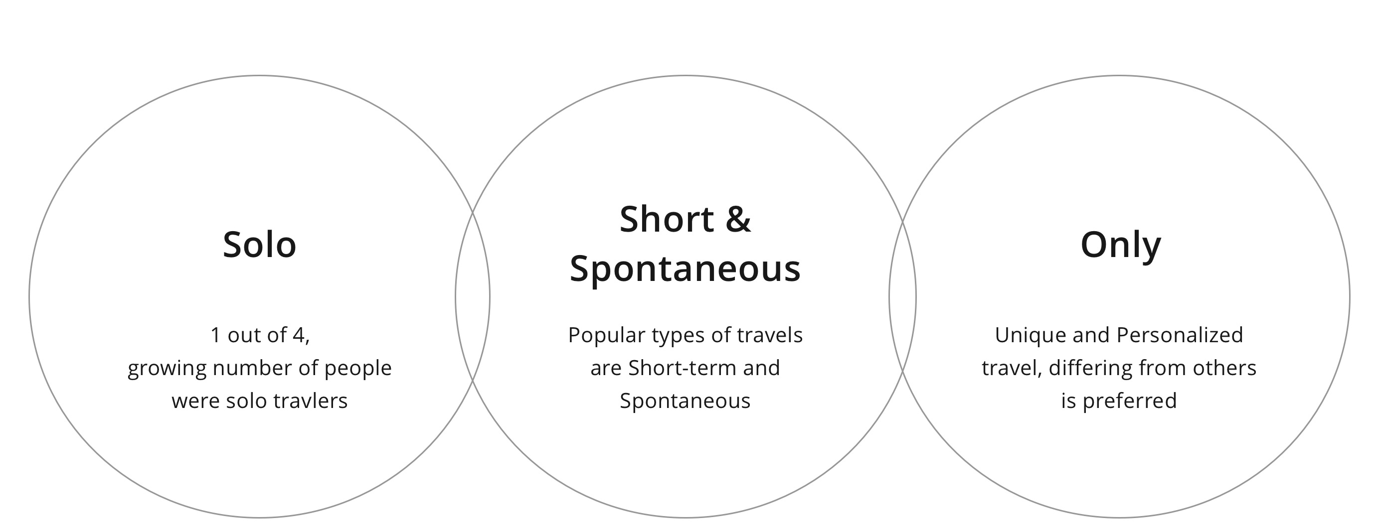
In Discover phase, tailored research is key. As a team-based research, we conducted basic research by assigning each other different foci: domestic trend, global trend, or current popular travel app services.
User Research & Competitive Analysis
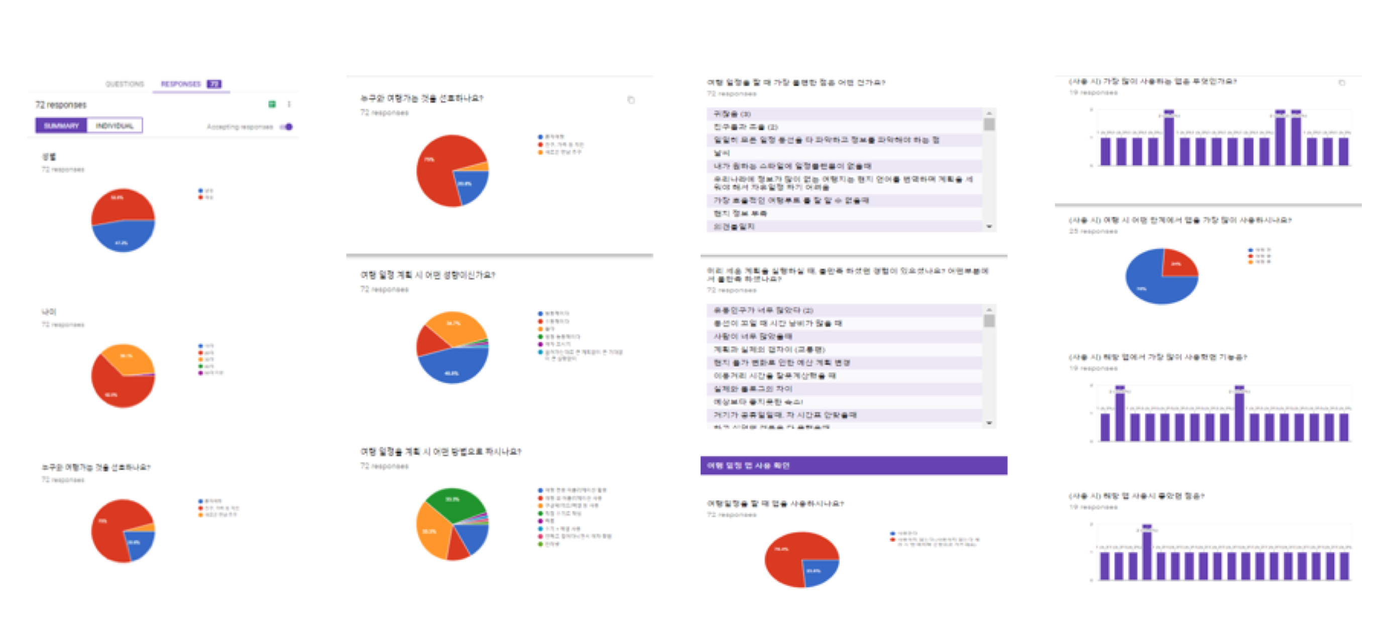
After basic research, we conducted a survey with 100+
participants,
and individual interviews to figure out current users' experiences with other travel
apps
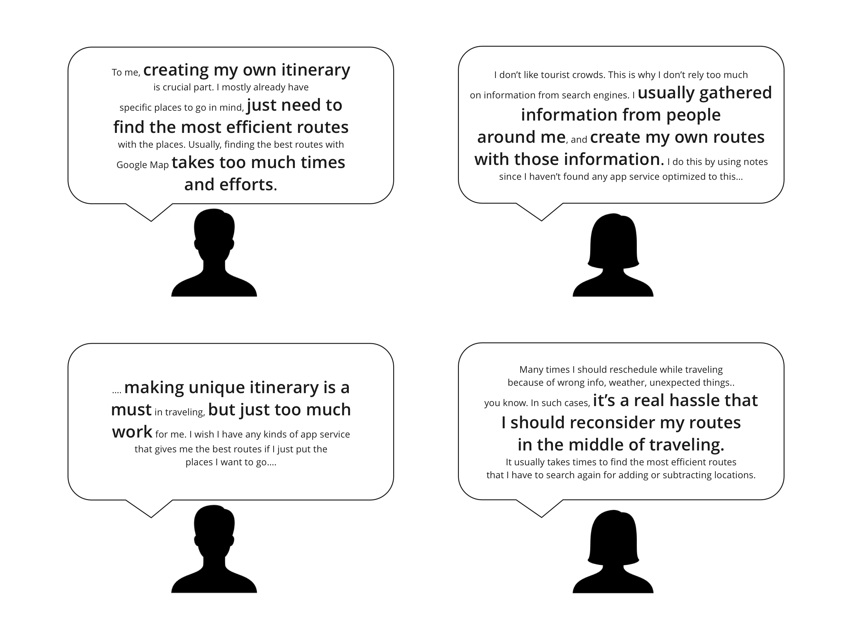
and problems they encountered. We later, selected 4 interviewees, who gave insightful responses for in-depth
individual interviews.
Each member conducted competitive analysis by analyzing different services. I individually looked at Google trip, Triplt, and Wishbeens. Later, we gathered and discussed insights and findings.
View competitive analysis
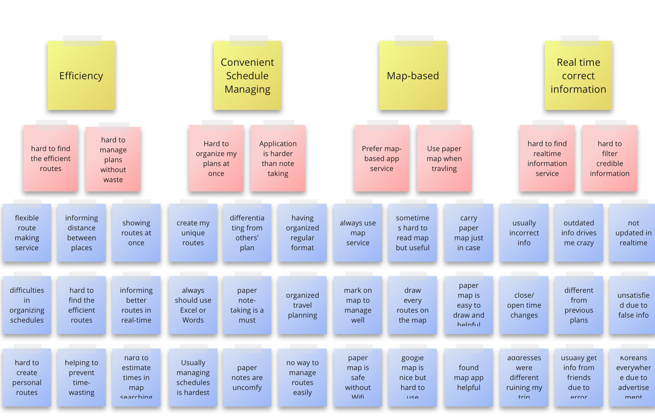
Affinity Map
Based on outcomes from discover stage, we used affinity map to gather data and organize them into groups based on their relationships.
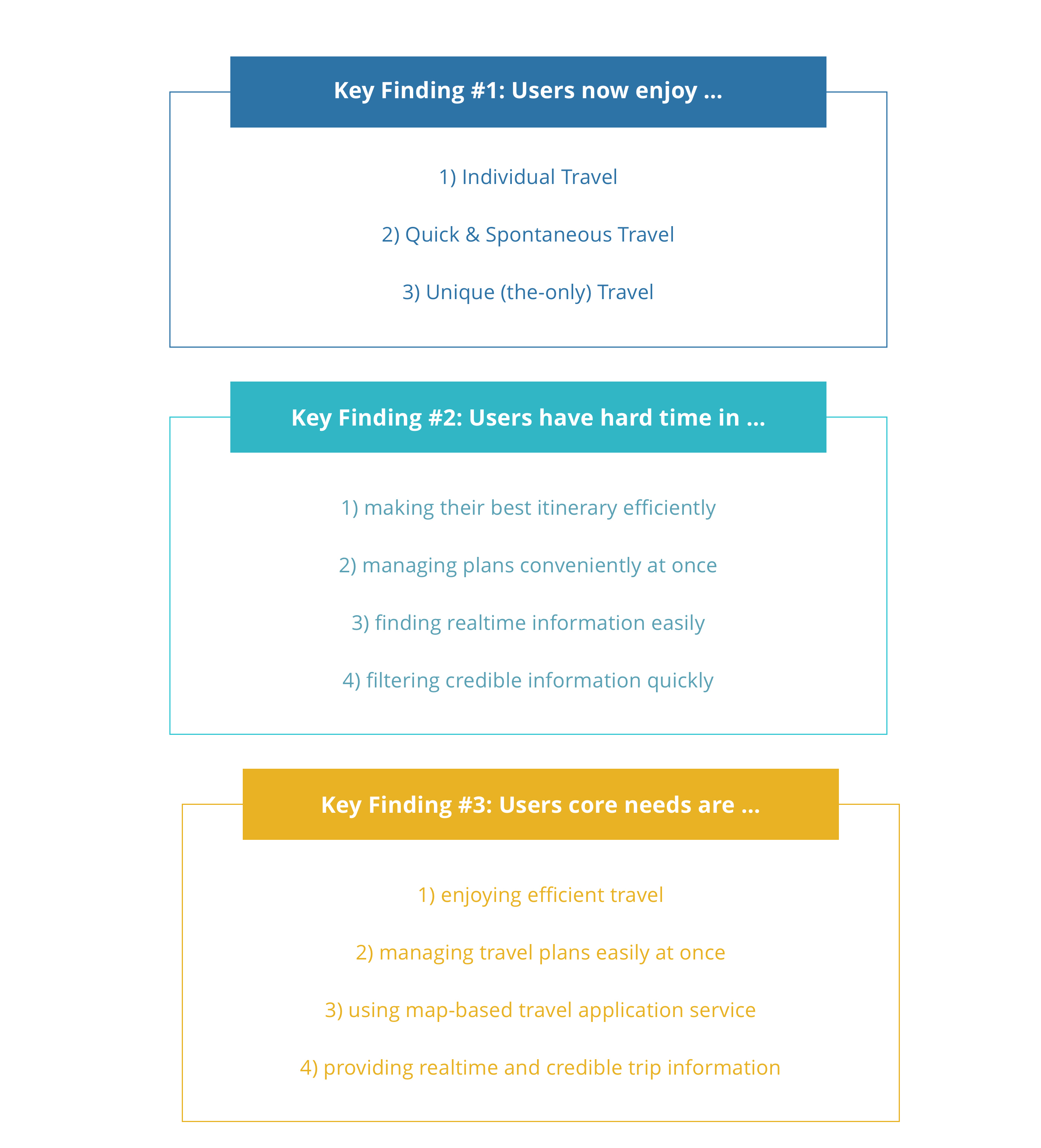
Key Findings
Among a number of findings and insight about travel application, our team decided to focus on one of the core user problems: it is difficult to effectively create my travel route.
There were two primary reasons: 1) we received the most responses about this problem and 2) the majority of users we interviewed highlighted that there were no satisfactory application in this matter.
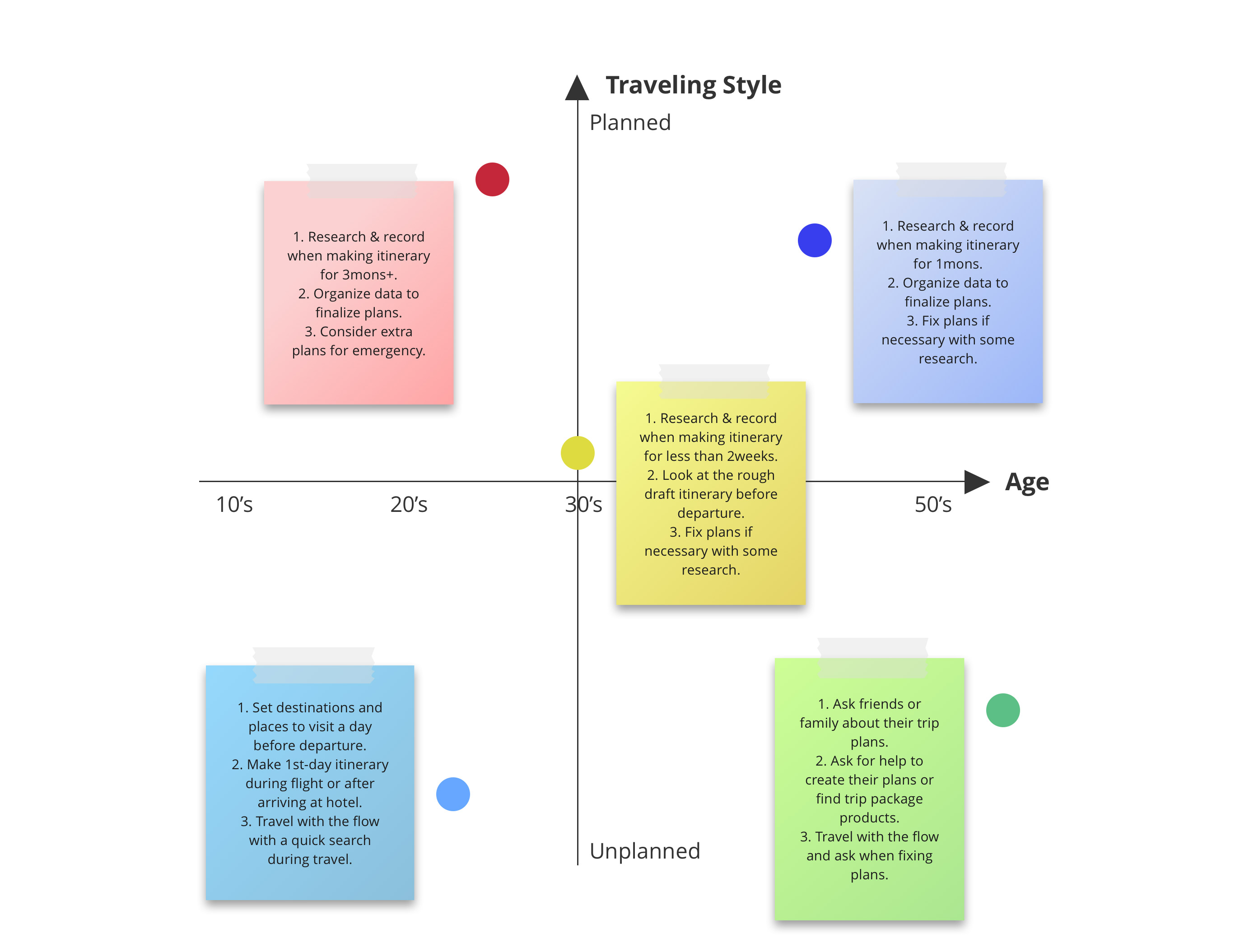
User Task Matrix
In order to clearly define target users, I asked myself: “Who is our target user?” In this process, we grabbed 5 sticky notes and defined 5 types of people who may need our service the
most.
I drew a user task matrix based on two most important factors,
age
and traveling style, as x and y axis criteria. We decided these two criteria based on the previous research. After, we wrote down three major tasks that such types of people
would perform when they need our
service.
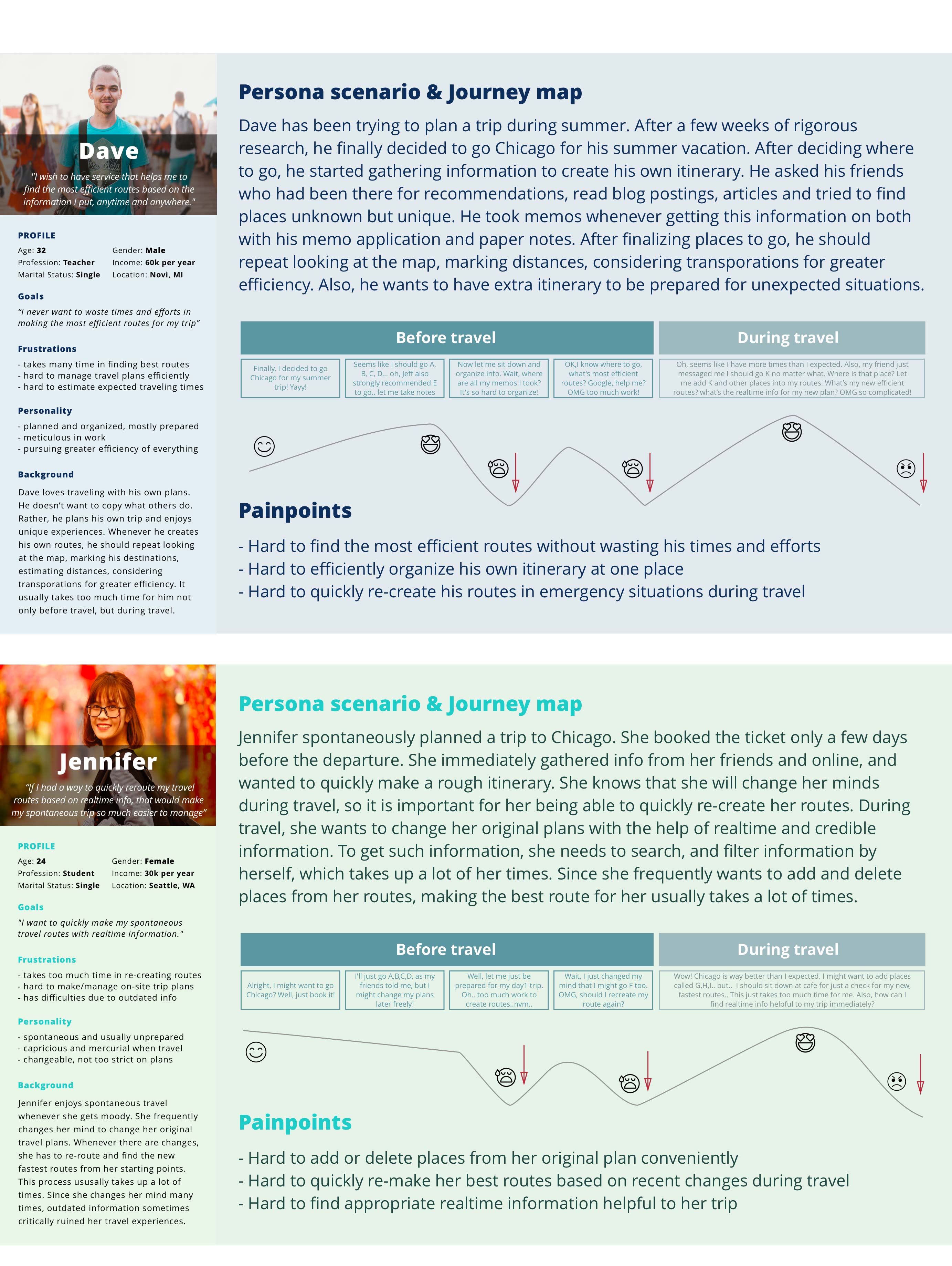
Persona and Journey Map
Through user task matrix, we decided that we wanted to target our users who are in 10s and 30s. This was because, while over 40s+ users do not often use mobile application, the age between 10s-30s mostly use mobile application when traveling.
Based on our target users, we created two personas and
journey map to better understand target users' goals, needs, and frustration.
Problem Statement
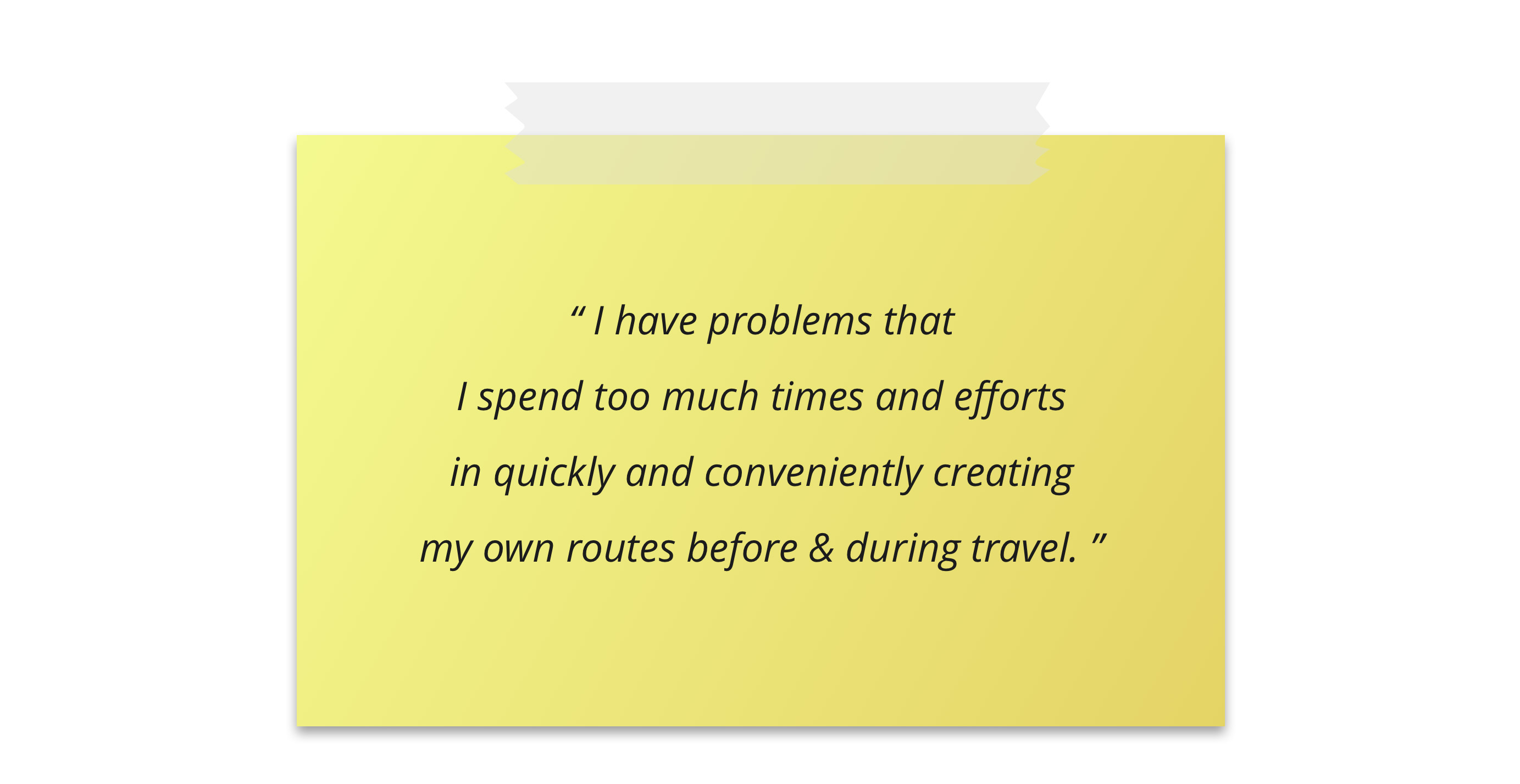
Based on previous discover and define stages, we finally wrote user problem statement to clearly define the problem we will address.
Ideation Sprint
In Develop phase, I should consider WHAT to deliver, a service
blueprint in order to address the problem.
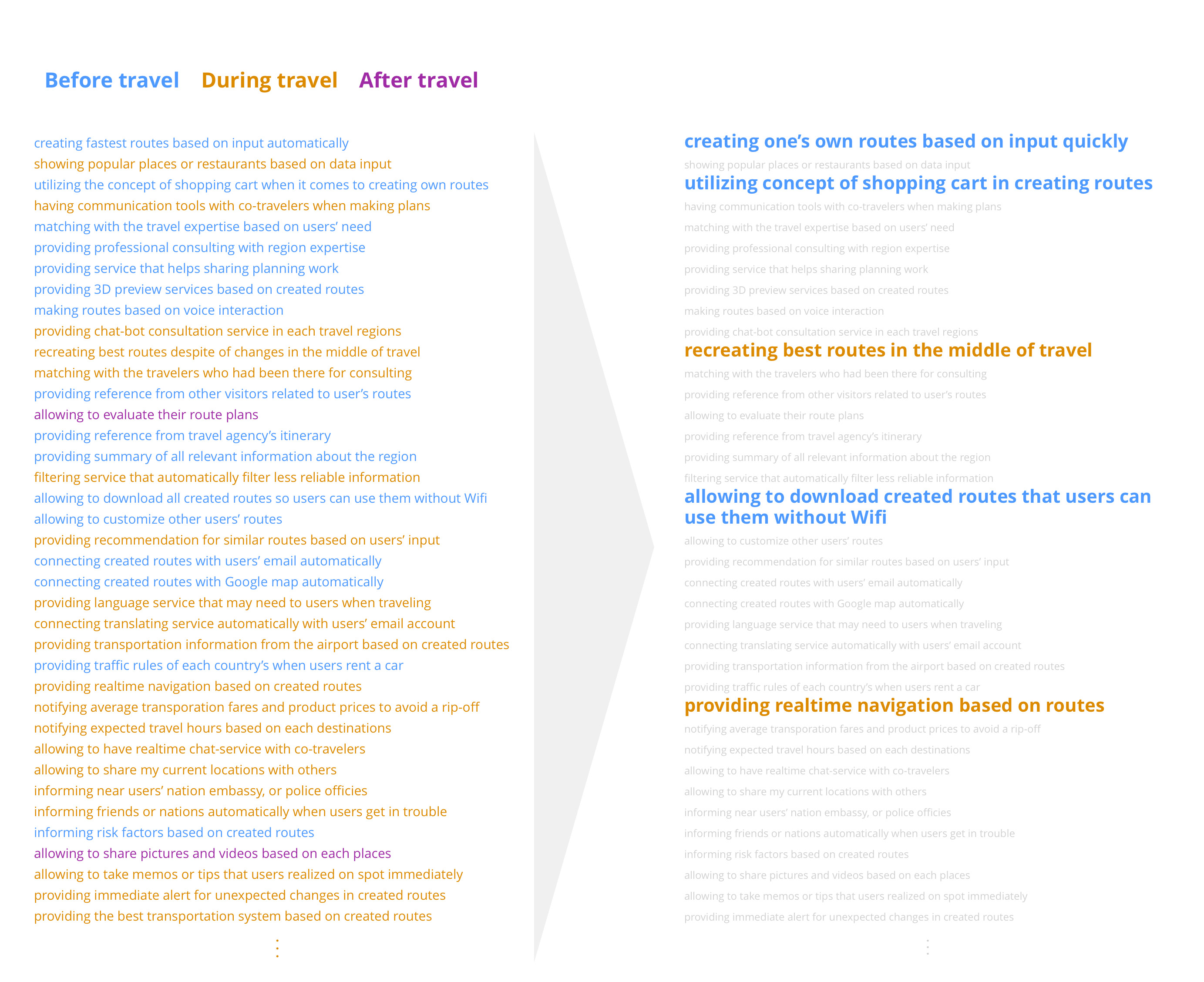
To do this, team members conducted ideation sprint
. Each member had 15 minutes of allotted time to come up with 30+ ideas to address users’ problems.
After exploring diverse ideas through ideation sprint and team discussion, each member picked the ideas that he or she wanted to focus on and decided to design one's own solution based on individual insight.
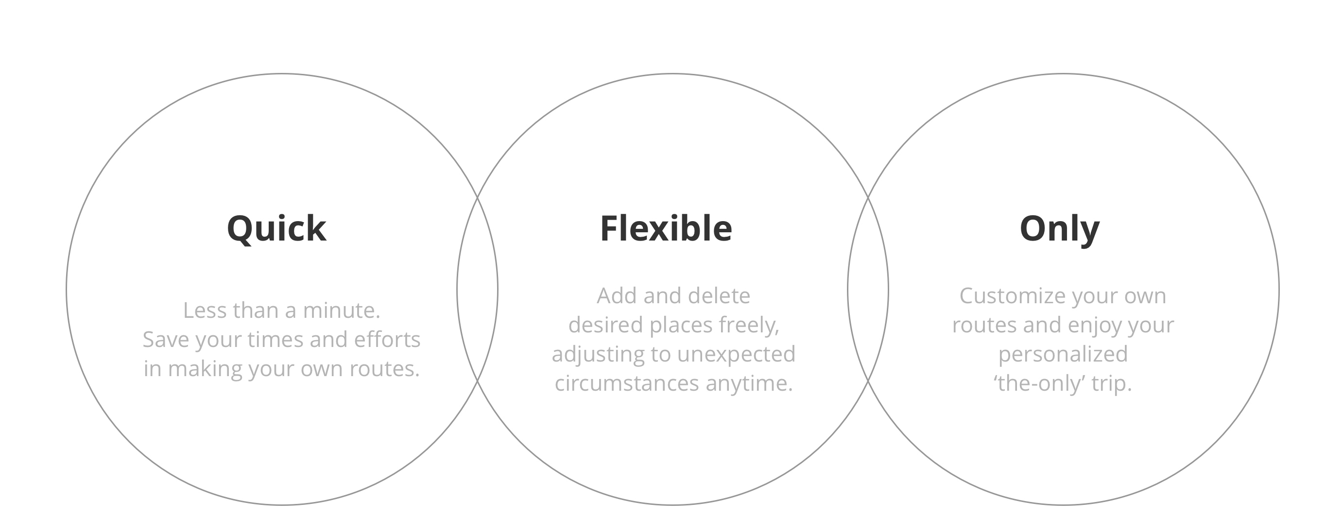
Service key features and concepts
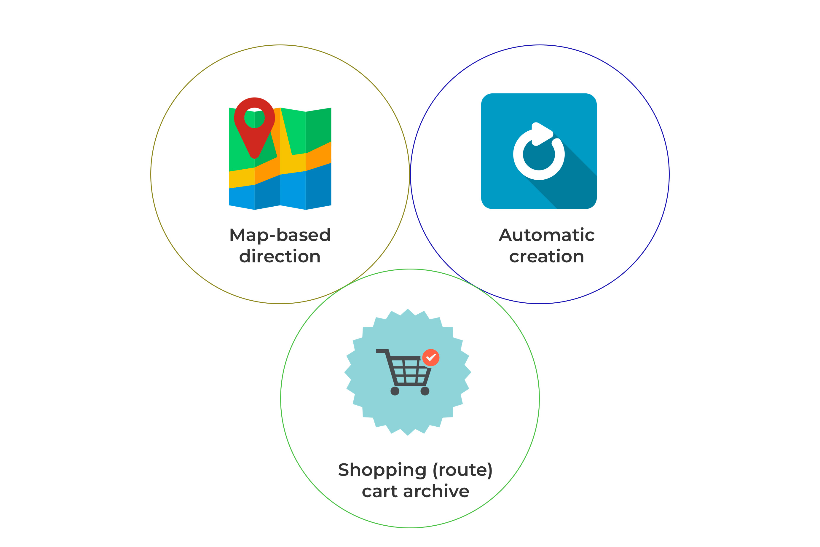
Based on my personal insight, I finalized service key features, service concepts to deliver unique UX values.
User Flow & Wireframes
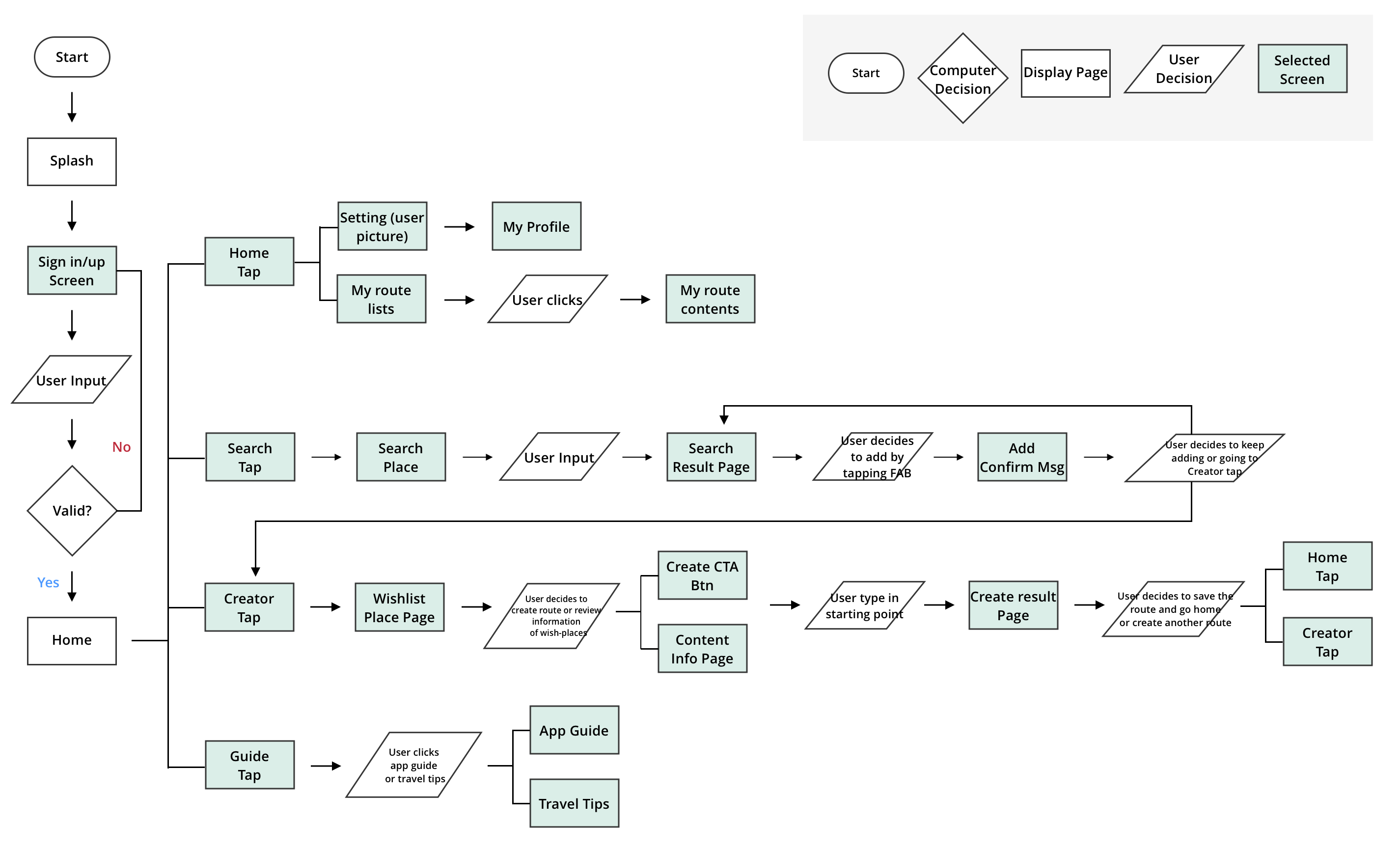
In Deliver phase, based on the previous processes, I drew user flow chart and wireframes. It was a great opportunity for me to think about information architecture and potential usability issues.
View full User flow & Wireframes
User Feedback & Design Iteration
I tested lo-fidelity wireframes by assigning users key tasks to complete. I was able to receive various feedback, which allowed me to iterate my design over and over again.
1) Search bar on home screen is confusing!
I received several feedback regarding search bar on home screen. This confuses users as it does not do general search as expected, but it is existed only for content search (saved routes).
2) Floating Action Button (FAB) on home screen is distracting!
Some mentioned that the location of FAB might disturb users browsing/focusing on contents. Some also commented that they prefer tap bar as a navigation, rather than FAB.
3) Some screens look too wordy!
Some mentioned that they would prefer having less or no text on screens. Also, they suggested that as I have guide tap on bottom navigation, wordy descriptions on each screen are not necessary.
Final Design
Based on all precious feedbacks, I created final design.

Impact & Reflection
Our team later gathered and voted for the best design among the solutions each member created. Route Creator received the most responses, and our team made it to 3rd place in in-house design competition among 23 other teams with this application.
This project gave me three important takeaways.
One: Although the market is red ocean, opportunities exist.
When I was initially given the project, I was worried that the great number of travel apps available might
make
it hard for me to come up with fresh ideas. However, I’ve found that there are always needs untapped, which
means
tailored research along with keen insights can always reveal opportunities.
Two: Feedbacks make everything “so much” better.
From UX research to design, I’ve received tons of feedback not only from users but also other designers
or
project managers. Users’ feedbacks are the core part of everything, helping me to fully empathize with their
need
so that I don't over-rely on my personal opinions. Other designers’ feedback allowed me to further consider
details
of my design based on professional UX and aesthetic views. Project managers’ feedback allowed me to consider
the
business value of my product.
Three: Great ideas are always coming from team discussions.
In this team setting, I truly enjoyed our team discussion and ideation sprint sessions. There were always great ideas coming from our team discussions and I realized the importance of being open to others views and ideas and embracing diversity. There are always great advantages of working together.
View More Projects
